Tutorial: Get started with Windows Forms Designer
The Windows Forms Designer provides many tools for building Windows Forms applications. This article illustrates how to build an app by using the various tools provided by the designer, including the following tasks:
- Arrange controls by using snaplines.
- Accomplish designer tasks by using smart tags.
- Set margins and padding for controls.
- Arrange controls by using a TableLayoutPanel control.
- Partition your control’s layout by using a SplitContainer control.
- Navigate your layout with the Document Outline window.
- Position controls with the size and location information display.
- Set property values by using the Properties window.
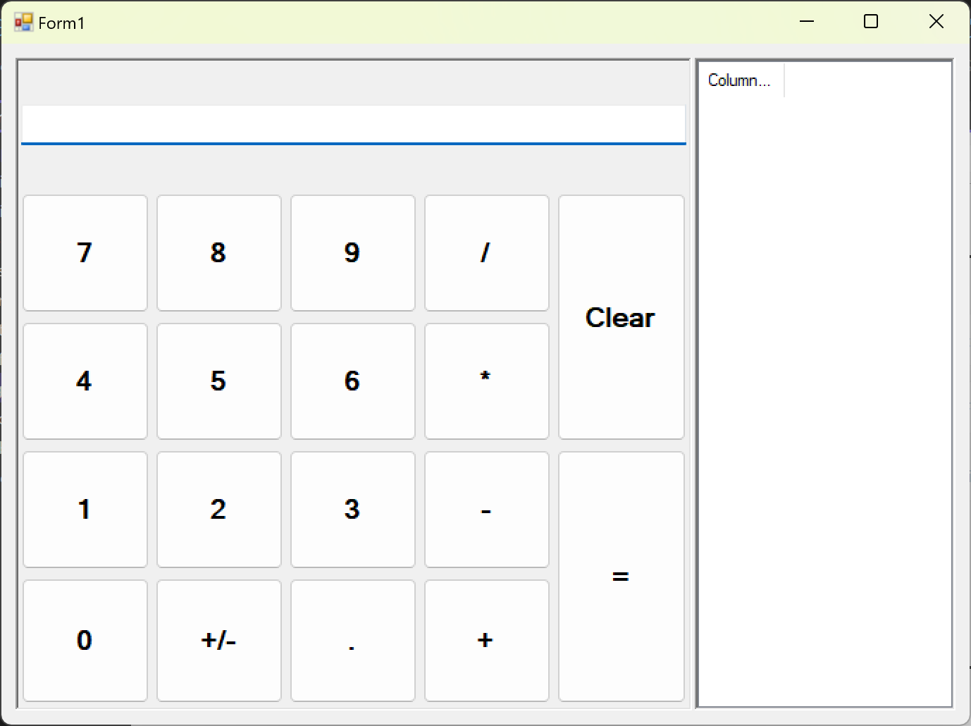
When you're finished, you'll have a custom control that's been assembled by using many of the layout features available in the Windows Forms Designer. This control implements the user interface (UI) for a simple calculator. The following image shows the general layout of the calculator control:

If you're a C++ developer and are looking for a tutorial to help you create a Windows app that includes forms and controls, see Creating a forms-based MFC application. For more generalized info, see Overview of Windows programming in C++.
Create the custom control project
The first step is to create the DemoCalculator control project.

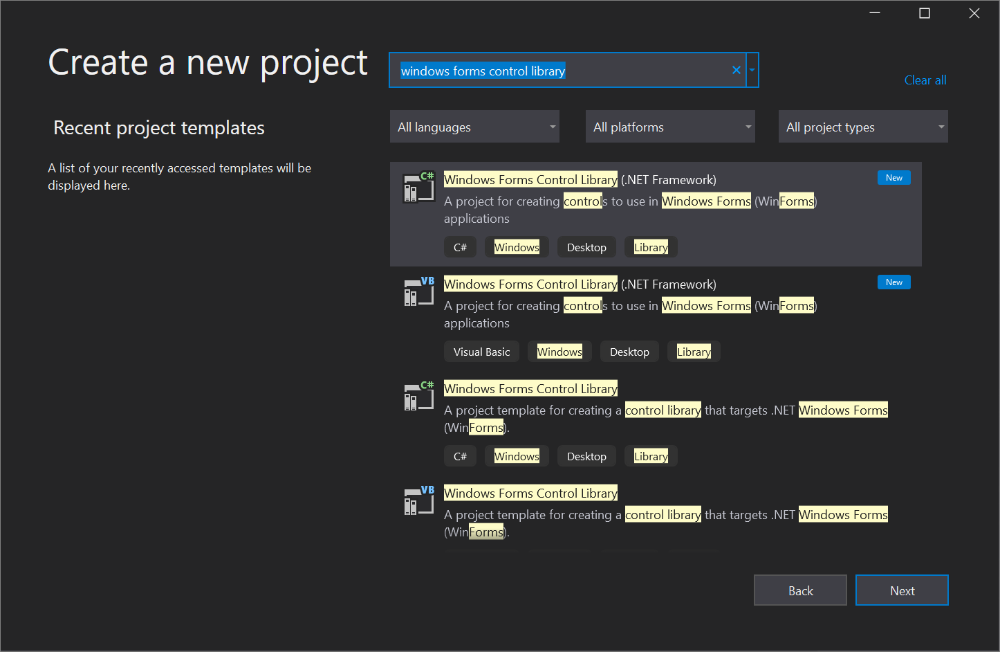
- Open Visual Studio and create a new Windows Forms Control Library project by using the .NET Framework template for either C# or Visual Basic. Name the project DemoCalculatorLib.
- To rename the file, in Solution Explorer, right-click UserControl1.vb or UserControl1.cs, select Rename, and change the file name to DemoCalculator.vb or DemoCalculator.cs. Select Yes when you're asked if you want to rename all references to the code element "UserControl1".
The Windows Forms Designer shows the designer surface for the DemoCalculator control. In this view, you can graphically design the appearance of the control by selecting controls and components from Toolbox and placing them on the designer surface. For more information about custom controls, see Varieties of custom controls.
Design the control layout
The DemoCalculator control contains several Windows Forms controls. In this procedure, you'll arrange the controls by using the Windows Forms Designer.
- In the Windows Forms Designer, change the DemoCalculator control to a larger size by selecting the sizing handle in the lower-right corner and dragging it to resize. In the lower-right corner of Visual Studio, find the size and location information for controls. Set the size of the control to width 1000 and height 800 by watching the size information as you resize the control. You can also scroll down to the bottom of the Properties window, which is usually docked the lower right corner, and manually enter the values in the Size property.
- In Toolbox, select the Containers node to open it. Select the SplitContainer control and drag it onto the designer surface. The SplitContainer is placed on the DemoCalculator control's designer surface.
Tip The SplitContainer control sizes itself to fit the size of the DemoCalculator control. Look at the Properties window to see the property settings for the SplitContainer control. Find the Dock property. Its value is DockStyle.Fill, which means the SplitContainer control will always size itself to the boundaries of the DemoCalculator control. Resize the DemoCalculator control to verify this behavior.
Note Several controls offer smart tags to facilitate design. For more information, see Walkthrough: Perform common tasks by using Smart Tags on Windows Forms controls.
Populate the control
Now that the layout of the control is set up, you can populate the DemoCalculator control with buttons and a display.
- In Toolbox, select the TextBox control icon. A TextBox control is placed in the first cell of the TableLayoutPanel control.
- In the Properties window, change the value of the TextBox control's ColumnSpan property to 5. The TextBox control moves to a position that is centered in its row.
- Change the value of the TextBox control's Anchor property to Left , Right . The TextBox control expands horizontally to span all five columns.
- Change the value of the TextBox control's TextAlign property to Right .
- In the Properties window, expand the Font property node. Set Size to 14, and set Bold to true for the TextBox control.
- Select the TableLayoutPanel control.
- In Toolbox, select the Button icon. A Button control is placed in the next open cell of the TableLayoutPanel control.
- In Toolbox, select the Button icon four more times to populate the second row of the TableLayoutPanel control.
- Select all five Button controls by selecting them while holding down the Shift key. Press Ctrl+C to copy the Button controls to the clipboard.
- Press Ctrl+V three times to paste copies of the Button controls into the remaining rows of the TableLayoutPanel control.
- Select all 20 Button controls by selecting them while holding down the Shift key.
- In the Properties window, change the value of the Dock property to Fill . All the Button controls dock to fill their containing cells.
- In the Properties window, expand the Margin property node. Set the value of All to 5. All the Button controls are sized smaller to create a larger margin between them.
- Select button10 and button20, and then press Delete to remove them from the layout.
- Select button5 and button15, and then change the value of their RowSpan property to 2. These buttons represent the Clear and = buttons for the DemoCalculator control.
Use the Document Outline window
When your control or form is populated with several controls, you may find it easier to navigate your layout with the Document Outline window.
- On the menu bar, choose View >Other Windows >Document Outline. Or, on the keyboard, press Ctrl+Alt+T. The Document Outline window shows a tree view of the DemoCalculator control and its constituent controls. Container controls like the SplitContainer show their child controls as subnodes in the tree. You can also rename controls in place by using the Document Outline window.
- In the Document Outline window, right-click button1, and then select Rename (keyboard: F2). Change its name to sevenButton.
- Using the Document Outline window, rename the Button controls from the designer-generated name to the production name according to the following list:
- button1 to sevenButton
- button2 to eightButton
- button3 to nineButton
- button4 to divisionButton
- button5 to clearButton
- button6 to fourButton
- button7 to fiveButton
- button8 to sixButton
- button9 to multiplicationButton
- button11 to oneButton
- button12 to twoButton
- button13 to threeButton
- button14 to subtractionButton
- button15 to equalsButton
- button16 to zeroButton
- button17 to changeSignButton
- button18 to decimalButton
- button19 to additionButton
- Using the Document Outline and Properties windows, change the Text property value for each Button control name according to the following list:
- Change the sevenButton control text property to 7
- Change the eightButton control text property to 8
- Change the nineButton control text property to 9
- Change the divisionButton control text property to / (forward slash)
- Change the clearButton control text property to Clear
- Change the fourButton control text property to 4
- Change the fiveButton control text property to 5
- Change the sixButton control text property to 6
- Change the multiplicationButton control text property to * (asterisk)
- Change the oneButton control text property to 1
- Change the twoButton control text property to 2
- Change the threeButton control text property to 3
- Change the subtractionButton control text property to - (hyphen)
- Change the equalsButton control text property to = (equals sign)
- Change the zeroButton control text property to 0
- Change the changeSignButton control text property to +/-
- Change the decimalButton control text property to . (period)
- Change the additionButton control text property to + (plus sign)
- On the designer surface, select all the Button controls by selecting them while holding down the Shift key.
- In the Properties window, expand the Font property node. Set Size to 14, and set Bold to true for all the Button controls.
This set of instructions completes the design of the DemoCalculator control. All that remains is to provide the calculator logic.
Implement event handlers
The buttons on the DemoCalculator control have event handlers that can be used to implement much of the calculator logic. The Windows Forms Designer enables you to implement the stubs of all the event handlers for all the buttons with one selection.
- On the designer surface, select all the Button controls by selecting them while holding down the Shift key.
- Select one of the Button controls. The Code Editor opens to the event handlers generated by the designer.
Since this tutorial is focused on the designer, we omit the implementation details of the calculator functionality.
Because the DemoCalculator control inherits from the UserControl class, you can test its behavior with the UserControl Test Container. For more information, see How to: Test the run-time behavior of a UserControl.
- Press F5 to build and run the DemoCalculator control in the UserControl Test Container.
- Select the border between the SplitContainer panels and drag it left and right. The TableLayoutPanel and all its child controls resize themselves to fit in the available space.
- When you're finished testing the control, select Close.
Use the control on a form
The DemoCalculator control can be used in other composite controls or on a form. The following procedure describes how to use it.
Create the project
The first step is to create the application project. You'll use this project to build the application that shows your custom control.
- Add a new Windows Forms App (.NET Framework) project to the existing solution and name it DemoCalculatorTest.
- In Solution Explorer, right-click the DemoCalculatorTest project, and then select Add >Reference to open the Reference Manager dialog box.
- Go to the Projects tab, and then select the DemoCalculatorLib project to add the reference to the test project.
- In Solution Explorer, right-click DemoCalculatorTest, and then select Set as StartUp Project.
- In the Windows Forms Designer, increase the size of the form to about 1400 x 1000.
Use the control in the form's layout
To use the DemoCalculator control in an application, you need to place it on a form.
- In Toolbox, expand the DemoCalculatorLib Components node.
- Drag the DemoCalculator control from Toolbox onto your form. Move the control to the upper-left corner of the form. When the control is close to the form's borders, snaplines appears. Snaplines indicate the distance of the form's Padding property and the control's Margin property. Position the control at the location indicated by the snaplines. For more information, see Walkthrough: Arrange controls by using snaplines.
- Drag a Button control from Toolbox and drop it onto the form.
- Move the Button control around the DemoCalculator control and observe where the snaplines appear. You can align your controls precisely and easily by using this feature. Delete the Button control when you're finished.
- Right-click the DemoCalculator control, and then select Properties.
- Change the value of the Dock property to Fill .
- Select the form, and then expand the Padding property node. Change the value of All to 20. The size of the DemoCalculator control is reduced to accommodate the new Padding value of the form.
- Resize the form by dragging the various sizing handles to different positions. Observe how the DemoCalculator control is resized to fit.
Next steps
This article has demonstrated how to construct the user interface for a simple calculator. To continue, you can extend its functionality by implementing the calculator logic, then publish the app by using ClickOnce. Or, continue on to a different tutorial where you create a picture viewer by using Windows Forms.
See also
- Windows Forms controls
- Accessibility for Windows Forms controls
- Publish by using ClickOnce

